
0038. Brand identity: Orbital Folio
Generated from docs/decisions/0038-brand-identity-orbital-folio.md
- Status: Proposed (2026-10-09)
- Date: 2026-10-09
Context and problem statement
Section titled “Context and problem statement”The product had placeholders instead of an identity: a black tile with a “u” stroke as the favicon and
the Docs and Studio logo, an inherited logo in the admin and the legacy front, no social image, and an
indigo/violet theme on the platform landing that was chosen for its looks, not as a brand. The product
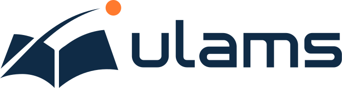
owner has chosen a concept, “Orbital Folio” (front/docs/design/brand/orbital-folio-board.png): an open
book of two page-wings with a thin arc that sweeps over it and ends in an orange dot, and a lowercase
“ulams” wordmark in squared, rounded letterforms. We need to turn the board into production assets and
apply it consistently, without touching what customers see on their own sites.
Decision
Section titled “Decision”Assets. The logo is redrawn as hand-written SVG (symbol, wordmark, horizontal and stacked lockups,
app icons light, dark and maskable, favicon, 1200 by 630 social image), each in four colourways: primary
(indigo with the orange dot), reversed (white with the orange dot), black and white. They are optimised
with svgo, have a viewBox, no raster, no text and no font reference. The geometry was traced against
the board and checked by overlaying renders of the SVG on the board until the shapes agreed to a few
pixels at board scale. One script, front/docs/design/brand/build.mjs (corepack yarn brand:build),
holds the geometry, writes the masters and exports (PNG, WebP, ICO), writes the geometry to
front/ui/src/brand/paths.ts for inline use, and copies the icons into the public folders of the web
app, the docs site, the admin, the legacy front and the API. The outputs are committed, so no app needs
a build step to use them.
Wordmark: drawn, not typeset. The five letters are simple rectilinear shapes with arcs, so they are drawn as paths instead of converting a font. The board’s letters are a custom design: a squared “u” with rounded bottom corners, an “l” with a foot, a single-storey squared “a” whose counter is a slot, a squared “m” and “s”. The open-licence faces closest in spirit (Exo 2, Saira and Orbitron, all SIL Open Font License 1.1, which does allow outlined glyphs in a logo) differ in exactly these details, so a conversion would not have matched the approved board and would have tied the identity to a font. Drawing the letters means no font licence applies to the logo and nothing has to be loaded at runtime. The interface keeps Inter, Inter Tight and JetBrains Mono (all OFL 1.1).
Colours and tokens. Indigo #0F2B46 and orange #FF7A2E, as --ulams-brand-indigo and
--ulams-brand-orange, plus two tints of indigo for accent text, --ulams-brand-blue #1F5A94 (large
accent text on a light page) and --ulams-brand-sky #8FB3D9 (accent text on a dark page). The values
live in three places that cannot import each other (the web UI’s base.css, the docs site’s
custom.css, the admin’s global.less); front/ui/tests/brand.test.ts fails if they drift.
Accessibility rule: orange is an accent. Orange on white is 2.6:1, which fails 4.5:1 for text and 3:1 for large text, icons and focus rings. So orange is used only for the orbit dot and small decorative graphics (a thin rule above the docs header and the admin sign-in header, the eyebrow dot and a progress bar on the platform landing); never for body text, links, input borders or focus indicators on a light background, and never with white text on an orange fill (indigo on orange is 5.5:1). Orange text is allowed on indigo (5.5:1) and on the near-black docs background (7.4:1). The test above pins these ratios.
Scope: platform and product, not tenants. The brand applies to the platform landing (indigo primary
and accent tint replace the violet; the header shows the horizontal lockup), the docs site (accent
colours, the lockup in the header with the reversed version in dark mode, favicon and social image), the
admin (the default logo on sign-in and in the navigation, the symbol when the navigation is collapsed,
the manifest and icons), the Course Builder rail, the legacy front’s icons and manifest, the “powered by”
logo in the legacy front’s footer and the “Built on ulams” mark in tenant footers, and the API’s
Swagger and email-verified pages. A tenant’s own logo, colours and theme always win: the admin uses
the configured logo, logoLogin and theme when present, and tenant themes never read the brand tokens.
Embedded player pages (H5P, SCORM, cmi5, LiaScript) run in iframes and have no favicon of their own.
Documentation. A Brand page in the docs site (Contributing) holds the concept, the variants with downloads, clear space, minimum sizes, colours and contrast rules, do and don’t, and how to use the assets in code.
Considered options
Section titled “Considered options”- Convert a font to outlines for the wordmark (Exo 2, Saira or Orbitron). Licence-clean, but does not match the approved letterforms and adds a font-derived artefact we would have to keep matching.
- Ship the board as raster and trace it automatically. Fast, but auto-traced paths are noisy and unreadable; hand-written paths with a few curves per shape are small and reviewable.
- A separate
@ulams/brandworkspace. Clean in principle, but the admin (umi) and the legacy front cannot consume an Astro workspace anyway; a generator that copies committed assets, plus a small Astro component in@ulams/uifor the web app, is the simplest thing that all four apps can use. - Use orange as the main accent (links, buttons). Rejected on contrast: it fails on white.
Consequences
Section titled “Consequences”- Every app now shows the same favicon, touch icon, PWA icons and social image; the documentation site and the platform landing carry the brand; tenants are unchanged.
- Changing the logo or a brand colour means editing
build.mjs(and the three token files), runningbrand:buildand committing the generated files. - The Hero accent gradient on the platform landing no longer ends in pink, and the platform buttons use indigo with a slightly lighter hover, to keep the brand to two hues.
- Trademark. The name “ulams” and the Orbital Folio mark have not been through a trademark search. A check is recommended before the public launch; it is an owner action, tracked in a separate issue.