
Brand
ulams has one visual identity, Orbital Folio, chosen by the product owner and recorded in ADR 0038. It applies to the product and the platform: the documentation site, the platform landing, the admin sign-in and navigation, the Course Builder, the apps’ icons and the “built on ulams” mark. A customer’s own site keeps the customer’s logo, colours and theme; it only carries the small ulams mark in its footer.
Concept
Section titled “Concept”An open book, two dark page-wings with the left one slightly smaller, and a thin arc that sweeps up from the lower left over the book and ends in an orange dot. The book stands for open knowledge. The arc is an orbit: courses that stay in sync with their sources, adapt to each learner and grow with traceable, cited knowledge.
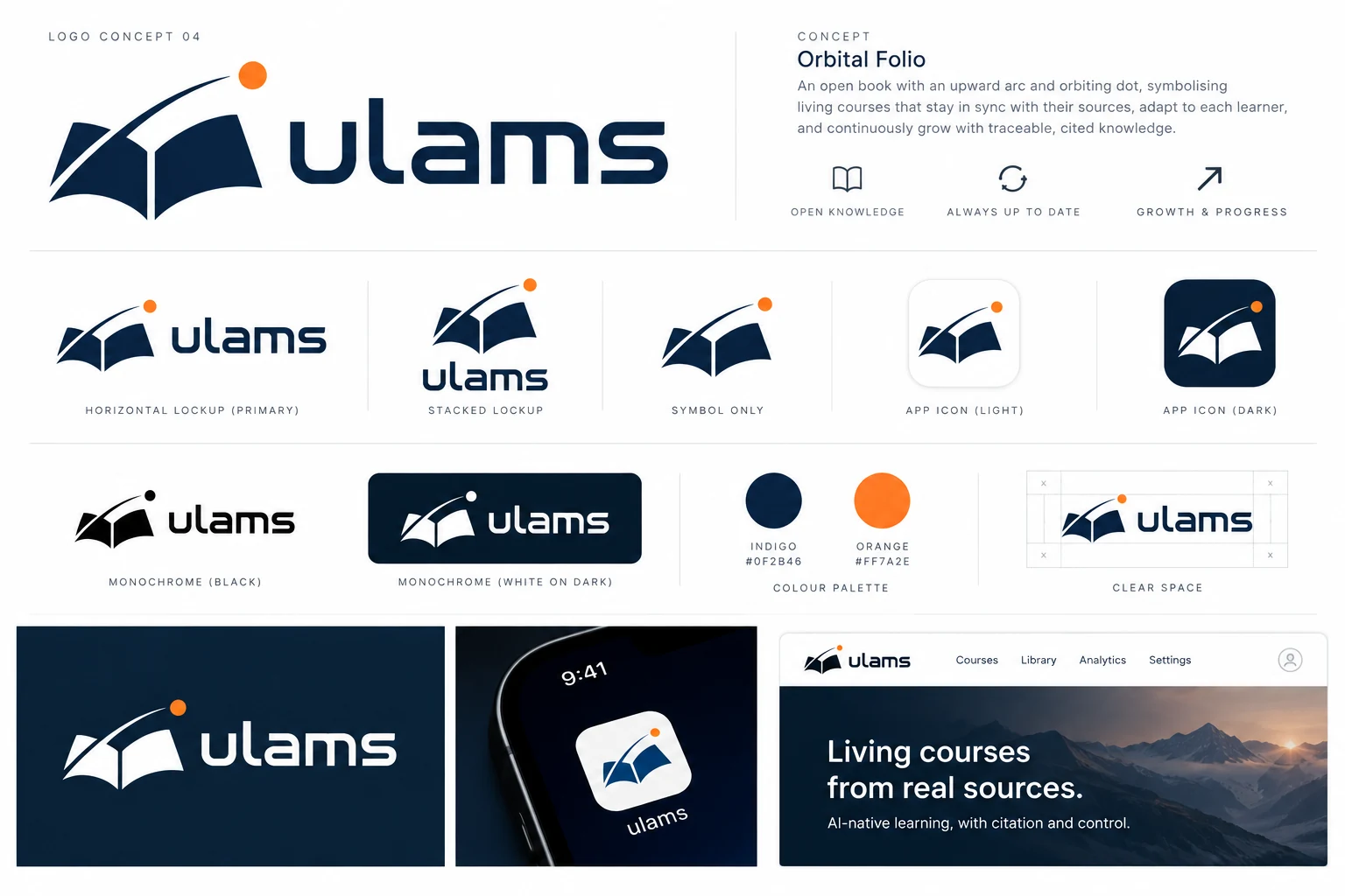
The board is the approved source of the identity. The original is committed as
front/docs/design/brand/orbital-folio-board.png;
the image above is its WebP copy for this site. The logo files below are redrawn from it as SVG
(see Using the brand in code), so when the two differ, the board and
ADR 0038 decide.

Use the horizontal lockup by default. Use the stacked lockup where the space is square or
narrow, and the symbol alone only where the name is already present (an app icon, a favicon, a
rail button). Every file is hand-written SVG with a viewBox, no raster image and no font.





Downloads
Section titled “Downloads”Each lockup comes in four colourways. Primary is indigo with the orange dot, for white and light backgrounds. Reversed is white with the orange dot, for indigo and dark backgrounds. Black and white are one-colour, dot included, for print, stamps, embossing and anywhere colour is not available.
| Form | Primary | Reversed | Black | White |
|---|---|---|---|---|
| Horizontal | SVG | SVG | SVG | SVG |
| Stacked | SVG | SVG | SVG | SVG |
| Symbol | SVG | SVG | SVG | SVG |
| Wordmark | SVG | SVG | SVG | SVG |










| Other | Files |
|---|---|
| App icon | light SVG, light PNG 1024, dark SVG, dark PNG 1024, maskable SVG |
| Favicon | SVG, ICO |
| Social image (1200 by 630) | PNG, SVG |




Clear space
Section titled “Clear space”Keep an empty margin around the logo on every side, at least the width of the letter u in the wordmark (about 40 % of the lockup’s height). No text, image edge or other logo enters that margin. The orbit dot is part of the logo and sits inside it.
Minimum sizes
Section titled “Minimum sizes”| Form | Screen | |
|---|---|---|
| Horizontal | 96 px wide | 25 mm wide |
| Stacked | 64 px wide | 16 mm wide |
| Symbol | 16 px wide (favicon on the dark tile) | 6 mm wide |
Below those sizes the left page-wing and the gap beside the arc close up. Use the favicon tile, which draws the symbol larger inside its square, instead of shrinking the lockup further.
Colours
Section titled “Colours”Indigo and orange are the brand. Blue and sky are tints of indigo for the places where indigo itself is too dark to show an accent: blue for large accent text on a light page (the platform hero), sky for links and accent text on a dark page.
Contrast rules (WCAG 2.2 AA)
Section titled “Contrast rules (WCAG 2.2 AA)”| Pair | Ratio | Use |
|---|---|---|
| Indigo on white | 14.4:1 | Text, links, buttons with white labels. |
| White on indigo | 14.4:1 | Reversed logo, text on indigo panels. |
| Indigo on orange | 5.5:1 | The only text colour on an orange fill. |
| Orange on indigo | 5.5:1 | Orange text or icons are allowed on indigo. |
Orange on near-black #0E0E10 |
7.4:1 | Orange accents on the dark docs theme. |
Blue #1F5A94 on #FAFAF9 |
6.8:1 | Large accent text on the platform page. |
Sky #8FB3D9 on #0E0E10 |
8.8:1 | Links and accent text in dark mode. |
| White on orange | 2.6:1 | Fails. Do not use. |
| Orange on white | 2.6:1 | Fails for text and for focus rings. Graphics only. |
The unit test front/ui/tests/brand.test.ts pins these rules, so a token change that breaks one
fails CI. The same file checks that the token values agree in the web UI, the docs site and the
admin.
Typography
Section titled “Typography”The wordmark is drawn, not typeset: the five letters u l a m s are geometric paths with
squared stems and rounded corners, traced from the approved board and outlined, so no font is
needed to display it and no font licence applies to the logo. Do not retype the name in another
font to imitate it; use the wordmark file.
Interface text uses the fonts already in the product: Inter for text, Inter Tight for headings and JetBrains Mono for code, all under the SIL Open Font License 1.1. The closest open-licence display faces to the wordmark (Exo 2, Saira, Orbitron; all OFL 1.1) can be used for headlines in marketing material, but never as a replacement for the wordmark.
Do and don’t
Section titled “Do and don’t”Do
- Use the supplied files; scale them proportionally.
- Use the primary logo on white or very light backgrounds and the reversed logo on indigo, dark or photographic backgrounds with enough contrast.
- Use the one-colour versions when colour is not available.
- Keep the clear space and the minimum sizes.
- Use orange for the dot and for small graphic accents.
Don’t
- Redraw, recolour, outline, stretch, rotate, add shadows or effects to the logo.
- Move the dot, change the arc, or separate the symbol from a wordmark that it appears with.
- Put the primary (indigo) logo on a dark or busy background.
- Set text in orange on white, or white text on orange.
- Use the ulams logo as a tenant’s own logo, or in a tenant’s header: customers keep their own identity.
- Put the symbol on a coloured tile other than the supplied app icons.
Where it is used
Section titled “Where it is used”| Surface | What it shows |
|---|---|
| Documentation site | Horizontal lockup in the header (reversed in dark mode), indigo and orange accents, favicon and social image. |
Platform landing (front/web) |
Horizontal lockup, indigo theme with an orange accent dot. |
| Course Builder | The symbol on the rail. |
| Admin | Horizontal lockup on sign-in and in the navigation, symbol when the navigation is collapsed. A tenant’s own logo, when configured, replaces it. |
| Tenant sites | A small “Built on ulams” mark with the symbol in the footer. Nothing else. |
| Apps and API pages | Favicon, touch icon, PWA icons and the social image in the web app, docs, admin, the legacy front and the API’s Swagger page. |
Using the brand in code
Section titled “Using the brand in code”The assets are generated from one script, so every app has the same files:
corepack yarn brand:buildThe generator is
front/docs/design/brand/build.mjs.
It writes the SVG masters to front/docs/design/brand/svg/, the PNG and ICO exports to
front/docs/design/brand/png/, the logo geometry to front/ui/src/brand/paths.ts, and copies the
icons into the public folders of the web app, the docs site, the admin, the legacy front and the
API. Run it after changing the geometry or a colour in build.mjs and commit the result.
In Astro components use the shared logo:
---import Logo from "@ulams/ui/brand/Logo.astro";---<Logo variant="horizontal" label="ulams" /> <!-- or variant="symbol", or add `mono` -->It reads --ulams-brand-indigo and --ulams-brand-orange, so a dark panel can set
--ulams-brand-indigo: #fff to get the reversed logo. In the admin and the legacy front, which
are not Astro, reference the SVG files in their public folders.